At H+Digital, the visual interpretations conference held at MIT last week, I saw some very cool examples of information visualization applied to the humanities. People were doing things like applying nodes-and-links diagrams to the relationships between music artists, treemaps to the contents of digital archives, tag clouds to the subjective experience of time (below), cartograms to historic Europe, sizing areas by difficulty of travel, and less glamorous things like scatter plots and bar graphs to reveal trends.
As striking as the visualizations were the meta-arguments about what visualization is doing to the humanities. It was sparked off by Johanna Drucker, who argued that newly minted “digital humanists” dabbling in visualization must avoid being dazzled by the pretty pictures they’re suddenly able to produce, and make sure any quantitative claims or assumptions they make are statistically sound. This seemed like a perfectly reasonable position to me, so I was surprised by the angry counter-arguments about how the humanities shouldn’t need to become like the sciences. The gist was that scientific methods are incapable of handling uncertainty, conflict, subjectivity, and multiple points of view, so we shouldn’t force humanists into those frameworks. I think this is true, to a certain extent, but experiments are experiments, whatever the discipline. Fortunately, and even though the arguments dominated the first day of the three-day conference, we reached a peaceful consensus: even though visualziations aren’t capable of providing a complete picture, that’s okay as long as the assumptions are clearly stated.
The reaction against the idea of humanities becoming like sciences worried me a little. As digital humanities researchers move from doing feeler experiments that check existing intuition, to discovery experiments that stake new claims (or, in @foundhistory‘s words, have beef), statistical soundness will not be optional.

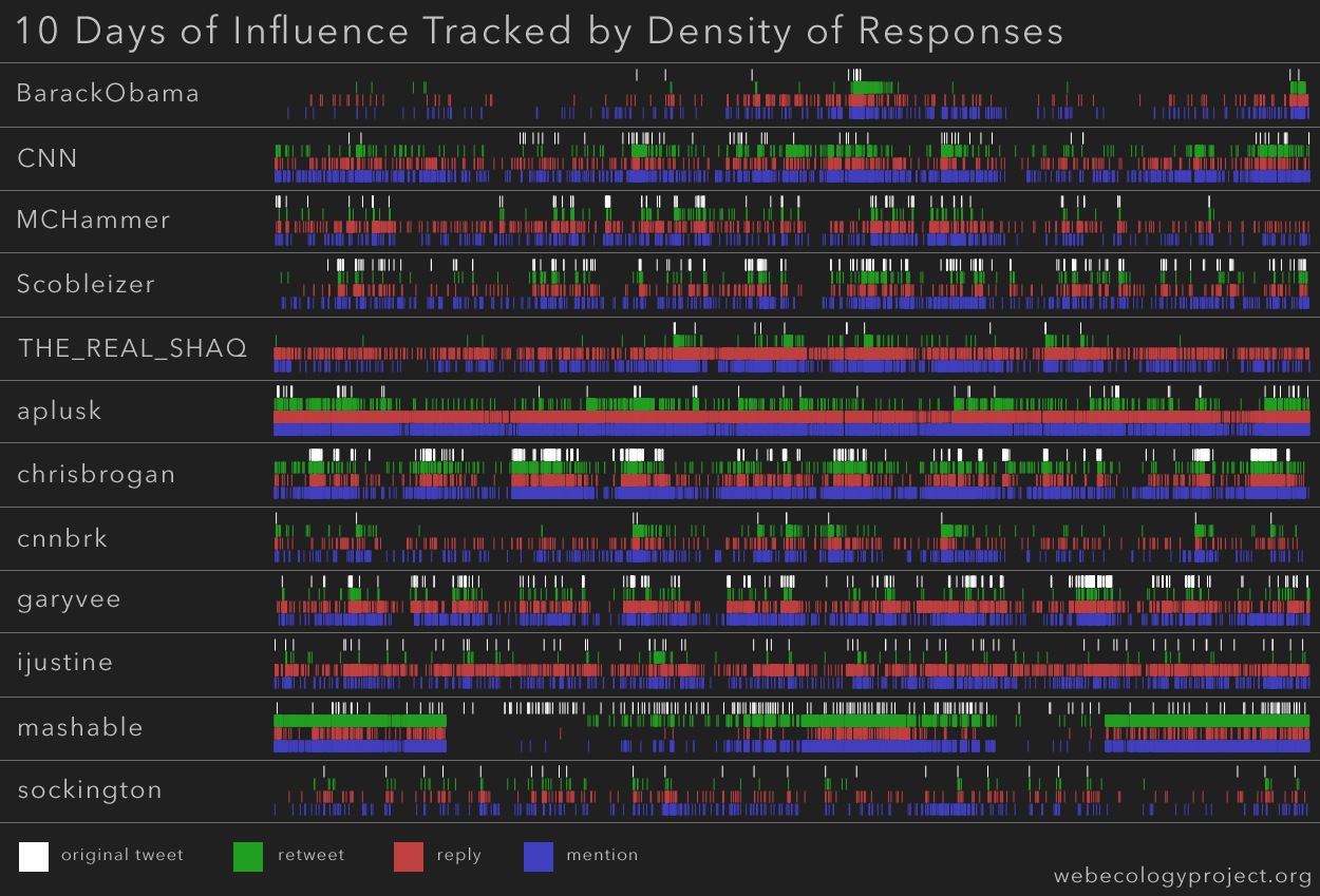
Stream visualization of top tweeters' influence
But caution aside, I’m excited about humanities researchers using visualization to ask new questions. At this very conference, I saw two completely new visualization techniques I’d never seen before. The first was this cool stream-like visualization (above) of twitter replies, mentions, and retweets, from which an overall picture of influence emerges. It was created by the Web Ecology Project, an interdisciplinary research group in Boston. It’s interesting because it’s the first visualization of stream-like data I’ve seen that gives a nice sense of aggregate trends, in a way that’s very complementary to the snapshot analysis of real-time data using a tag cloud or a network diagram or something else.
Another fascinating idea, from Prof. Amit Ray and students from the department of English at the Rochester Institute of Technology was the use of Venn diagrams to navigate a collection of tagged photographs (my sketch above, I’ve asked Amit for a better picture). For collection browsing, we’re used to tag clouds, hierarchical faceted metadata, search boxes… but Venn diagrams? I’ve never seen that before. A user can specify up to three tags for photos they’d like to see (e.g. “outdoors”, “winter”, “boston”) and be shown a visual arrangement of photos laid out according to a Venn diagram, with photos matching all three tags shown in the middle, and with other tags related to the different subsets of photos shown at the sides. The advantage of this is that it becomes easy for the user to dynamically browse related tags and create new sets of photos, without having to zoom out to a tag cloud, and zoom back in.
Even though visualization is a new field and suffers from many of the literacy problems that plagued desktop publishing in the early days (in Martin Wattenberg‘s words, “everything looked like a ransom note”), it’s new to everyone, so the humanities have an equal stake in pushing out its boundaries and inspiring new methods.


